
How we rebuilt our design language in three days with AI
 Rafael
On September 18 the New York Times ran a story about the Bauhaus, the German design school that is still the reference for much of how the modern world looks, nearly a century after it closed. It left us with a question: what would curiosity.ai look like as a Bauhaus poster? We are a German company that builds software for engineers, so we tried it.
The next afternoon the whole site, all 67 pages, was rebuilt as a Bauhaus poster. A week later we had tried twenty-one other directions, run a knockout to pick between them, and taken in a new brand system from our design work. Then, in three days, we rebuilt the website, the blog, the documentation chrome and our slide decks in that brand. The brand itself, and the lessons, are at the end.
A Bauhaus poster, by the afternoon
The starting point was a brief, not "make it look like the Bauhaus": the company facts we are allowed to state, the product story, the page inventory from the live sitemap, and a design direction in five rules. Four inks on a warm paper. Circles, half circles, triangles and squares, and nothing rounded that is not a circle. No shadows, no gradients. One typeface. The grid is visible.
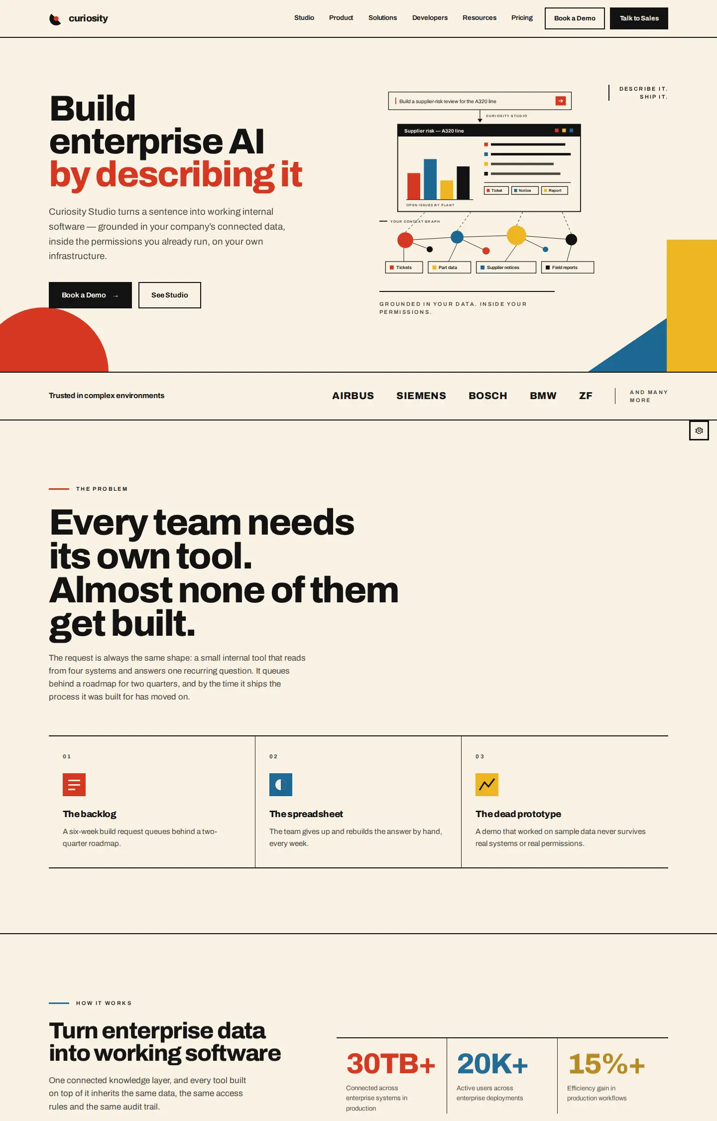
The landing page came first. The other 66 pages followed in batches within the hour: use cases, developer pages, comparison pages, customer stories, the Trust Center, legal shells. That speed is possible because the site is a small static generator: pages are modules, the masthead and footer are shared, and every link is checked at build time.
We expected it to be fast. We did not expect it to look designed. The spacing was consistent, the hierarchy read, and the diagrams were real diagrams of the product, drawn in the style's own geometry. The brief had taste in it, and the model followed the brief closely.
It also had problems. The first responsive check reported a clean pass on every page. It had not looked at a single one: a call signature was wrong, the error was swallowed, and the loop skipped everything. Repaired, it found 43 diagram labels that rendered under 9px on a phone.
Twenty-one more sites, each a full copy
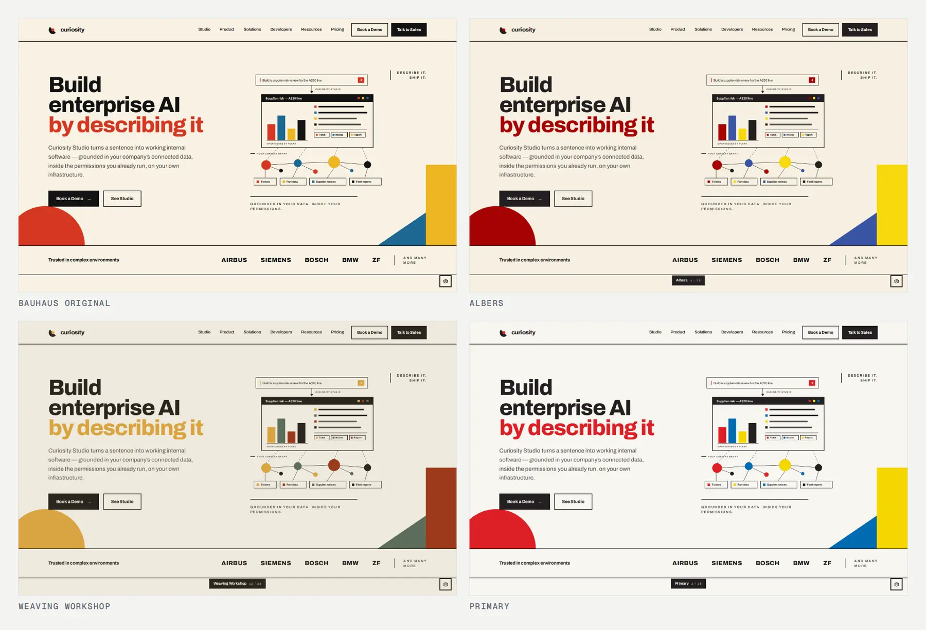
Why only this one? On day two we added a cog to the corner of every page. It swapped between 28
palettes, from the Bauhaus original and classic poster palettes to five-color strips we supplied,
switched the wordmark between curiosity, curiosity.ai and curiosity.AI, and could lay a
print grain over the flat color.
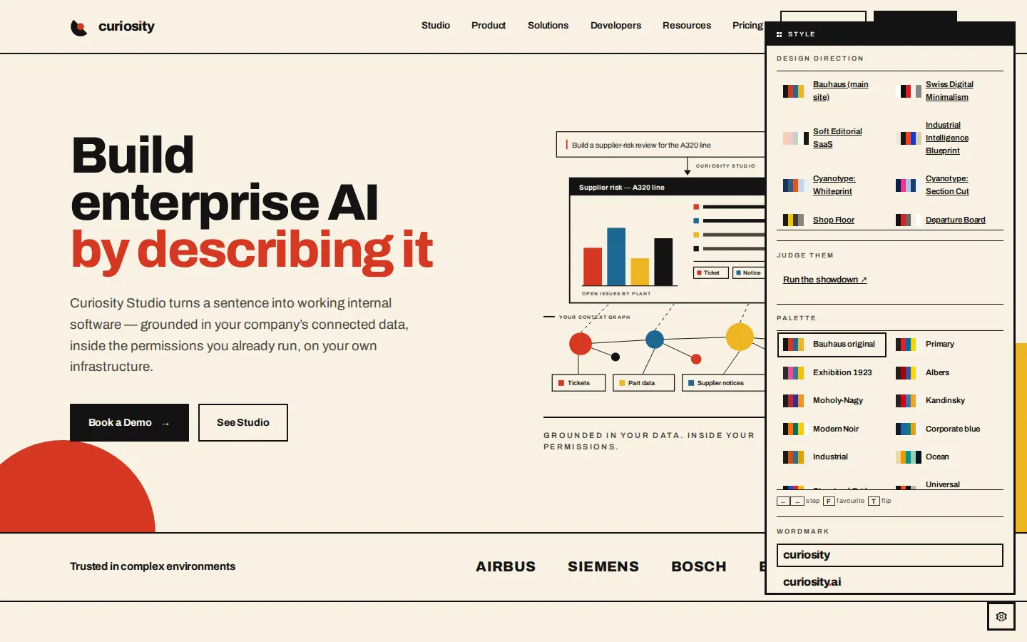
Two details made it useful. The arrow keys stepped through palettes without opening the panel,
so you looked at the page and not at the control. F set a favorite and T flipped between the
favorite and wherever you were, because comparing a candidate against the one you like is the
comparison you make over and over.
A palette only changes the color, and some ideas disagree about more than that. So each new
direction became a whole copy of the site, with its own stylesheet, its own shell and its own
site/figures.js, where every diagram is drawn. A shared stylesheet with twenty override files
would have made each direction a negotiation with the other twenty; a copy could go as far as the
idea went. Every copy carried the same 67 pages and the same words, so two directions could be
compared on the page you cared about.
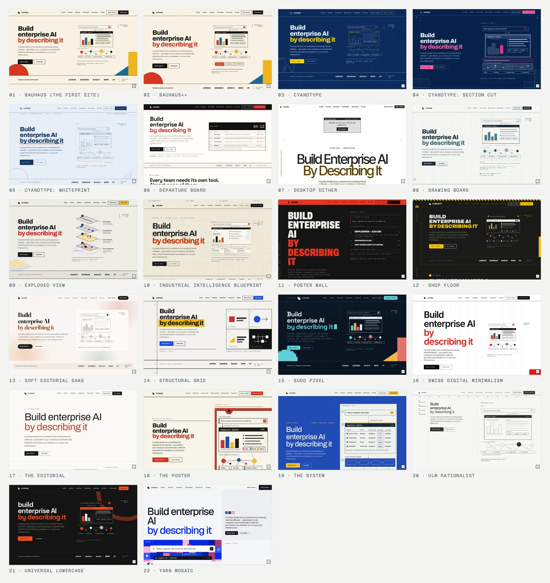
By September 23 there were twenty-one of them, plus the original.
The crazier ones
Some were safe: Swiss minimalism, a blueprint, an editorial page. We kept pushing on the ones that were not, because a cheap experiment is what lets you afford the strange ones.
Desktop Dither is a 1984 graphical desktop blown up to poster size. Everything that is a thing is a window, every tone is a 1-bit pattern, and the halftone blobs are computed in CSS. The field color started as flamingo pink, read as a consumer brand, and was changed to the amber of the Bauhaus palette. Poster Wall has no images at all. Type is the only picture, condensed headlines stacked to the baseline.
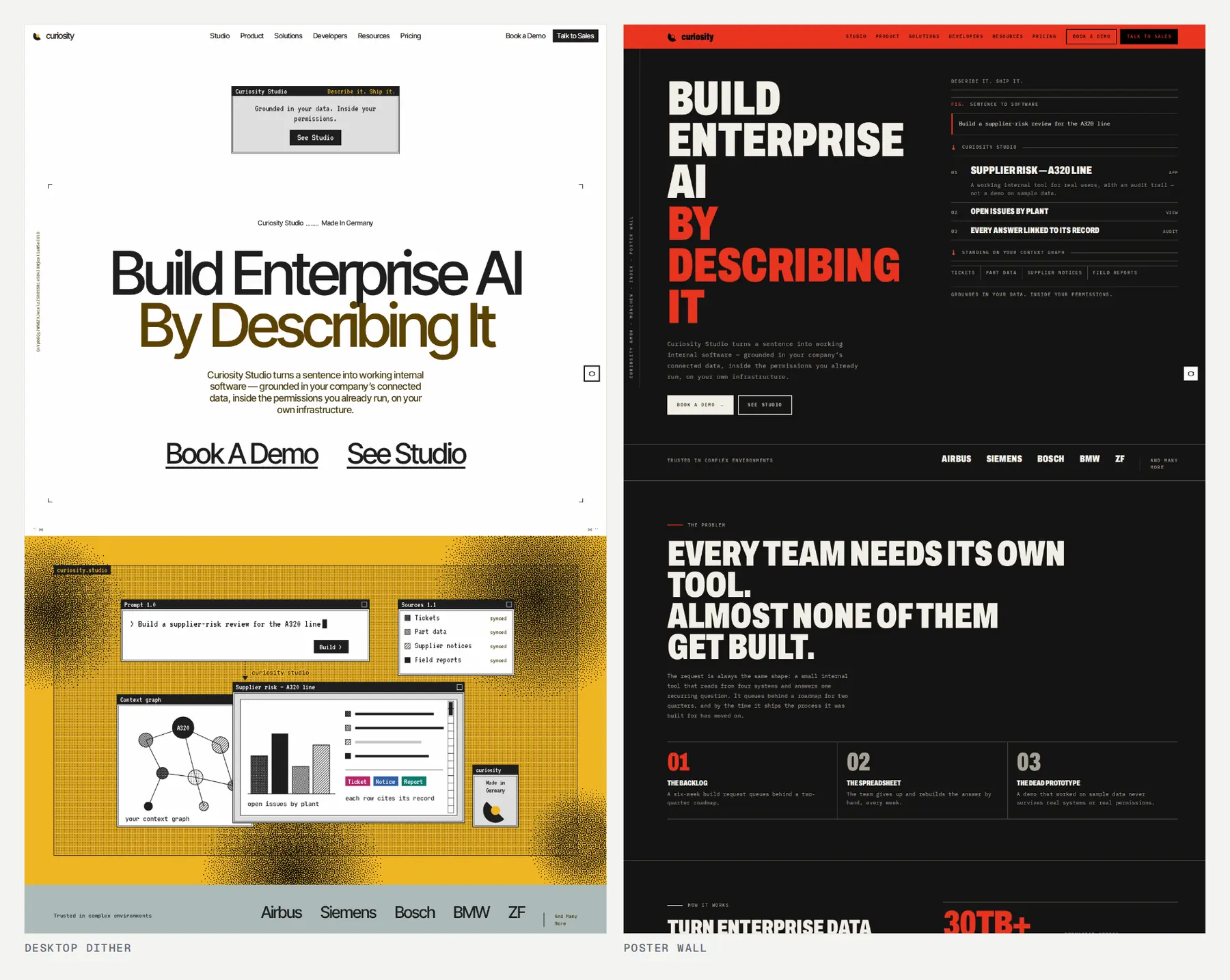
Sudo Pixel draws the whole site at a resolution. Every disc is a rasterized circle traced as a staircase, every corner a two-step chamfer, every gradient a dither between two flat values. A bitmap display face was tried there and taken out: the pixels were already making that point, and pixel headlines tipped it into novelty. Exploded View draws every diagram in one fixed 20 degree axonometric projection, so the product stack, the security model and the flow are parts of one assembly.
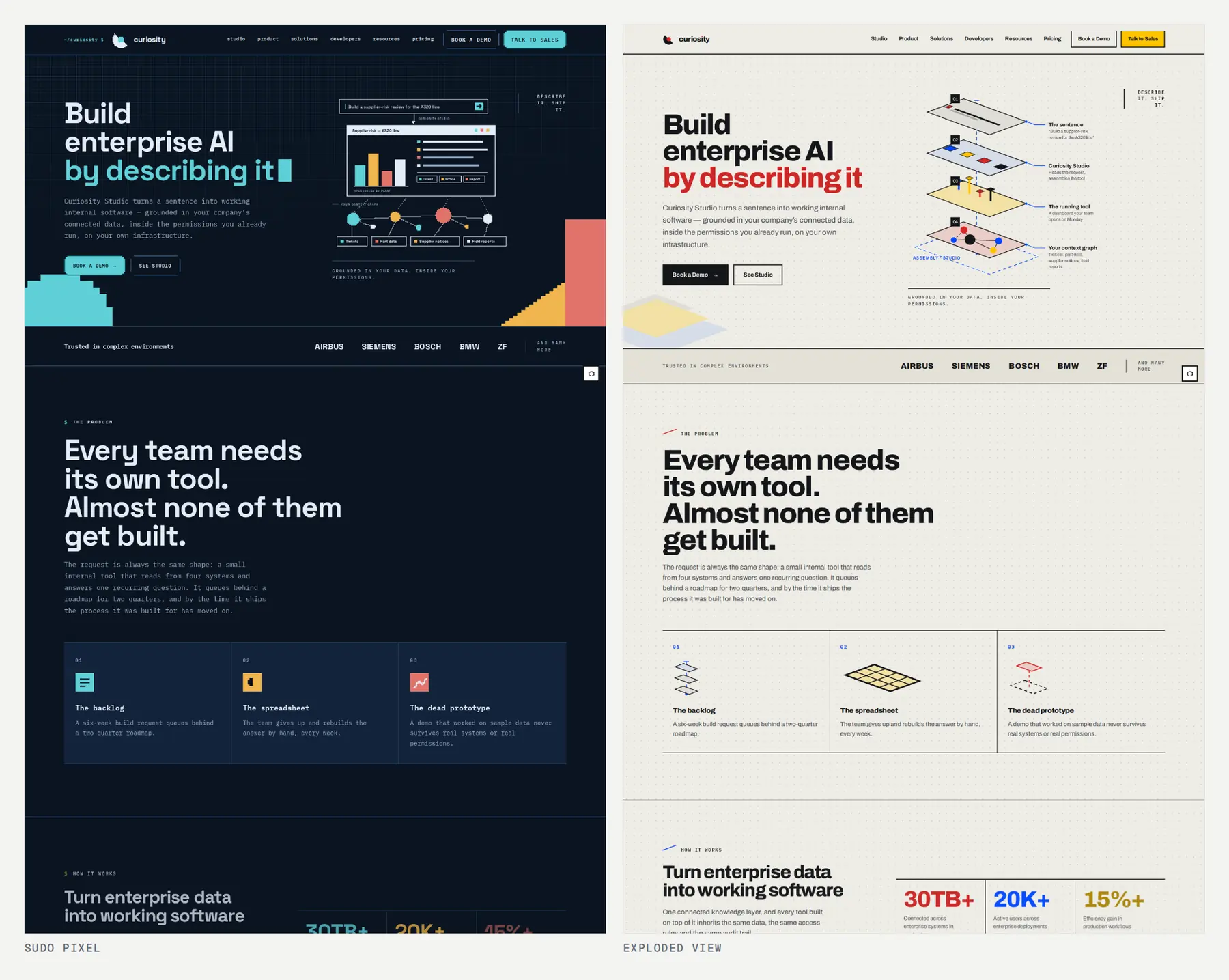
Departure Board makes the hero a table, a live register of tools with sources, owners and status. Soft Editorial SaaS is the furthest from the poster: cream, pastels, a serif, rounded corners and a grain. It existed to answer one question: does the buyer we write for read warmth as approachable, or as unserious?
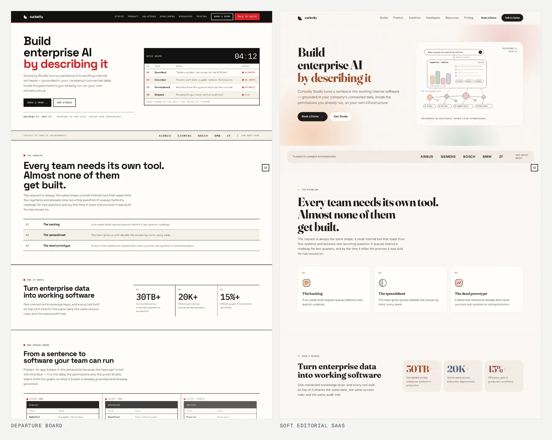
None of these was drawn by a person; all of them were directed by one. Each started from a brief of a few hundred words (a palette with hex values, a type pairing, five or six key features) and went through rounds of review.
What the styles did to the drawings
Our site has no product screenshots and no stock art. Every picture is an inline SVG diagram of a mechanism: what connects to what, and in what order. That rule was the best test of a direction: a palette is easy to change, and redrawing the same idea in a new visual language is where a style shows whether it has anything to say. Here is the same three-step flow (describe it, ground it in your graph, ship it to your team) as twelve of the directions drew it.
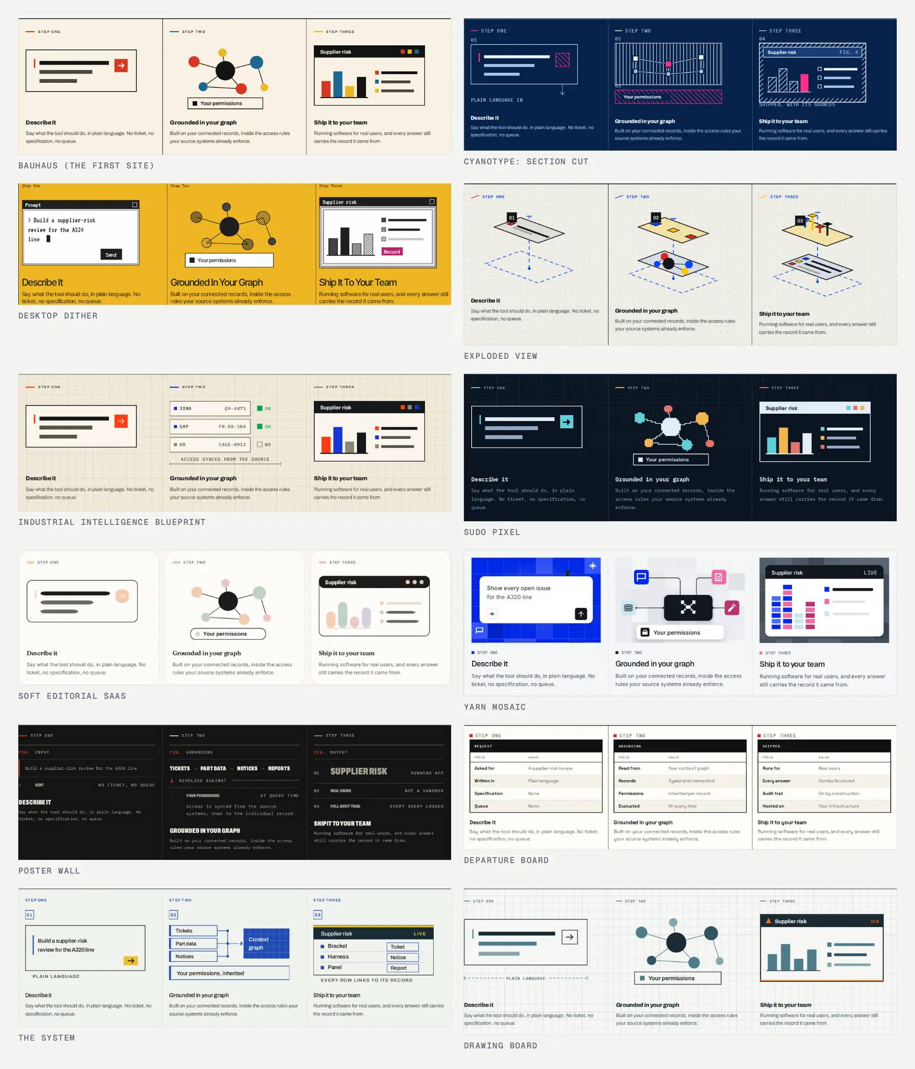
Several ideas that ended up in the brand came from here:
- Industrial Intelligence Blueprint drew the graph as evidence. A record is a card with its source system, its record id, one line of what it says and its permission state. An answer is those cards joined to a panel that cites them. Everything the site claims about grounding got a picture.
- Exploded View showed that one fixed projection for every diagram makes a company's drawings read as one set of drawings.
- Poster Wall and Departure Board showed how far you can go with no illustration at all, and what you lose: the mechanism, which is the product.
- Yarn Mosaic put Sudo, our pixel cat, on the page. He walks the foot of every page with the reader and chases a ball of yarn. The whole palette was read off his sprite sheet, so the cat and the page are one palette rather than a guest and a host.
The directions also found bugs in the drawings. Text inside an SVG scales with the drawing, not
like text, so a figure can pass every overflow check and still letter its labels at 5px. The
figure helpers now do that arithmetic: LABEL(W) returns the smallest type size that clears the
legibility floor on a grid W units wide. Wrapping each figure in a card cost the drawings 32px
of phone column, and sixteen comparison pages fell under the floor while passing every other
check, until the column width was re-measured. And a filter: url() pointing at nothing does not
degrade to no filter: the element disappears.
A knockout to pick one
Twenty-two sites cannot be judged by opening twenty-two tabs, so we built a small game.
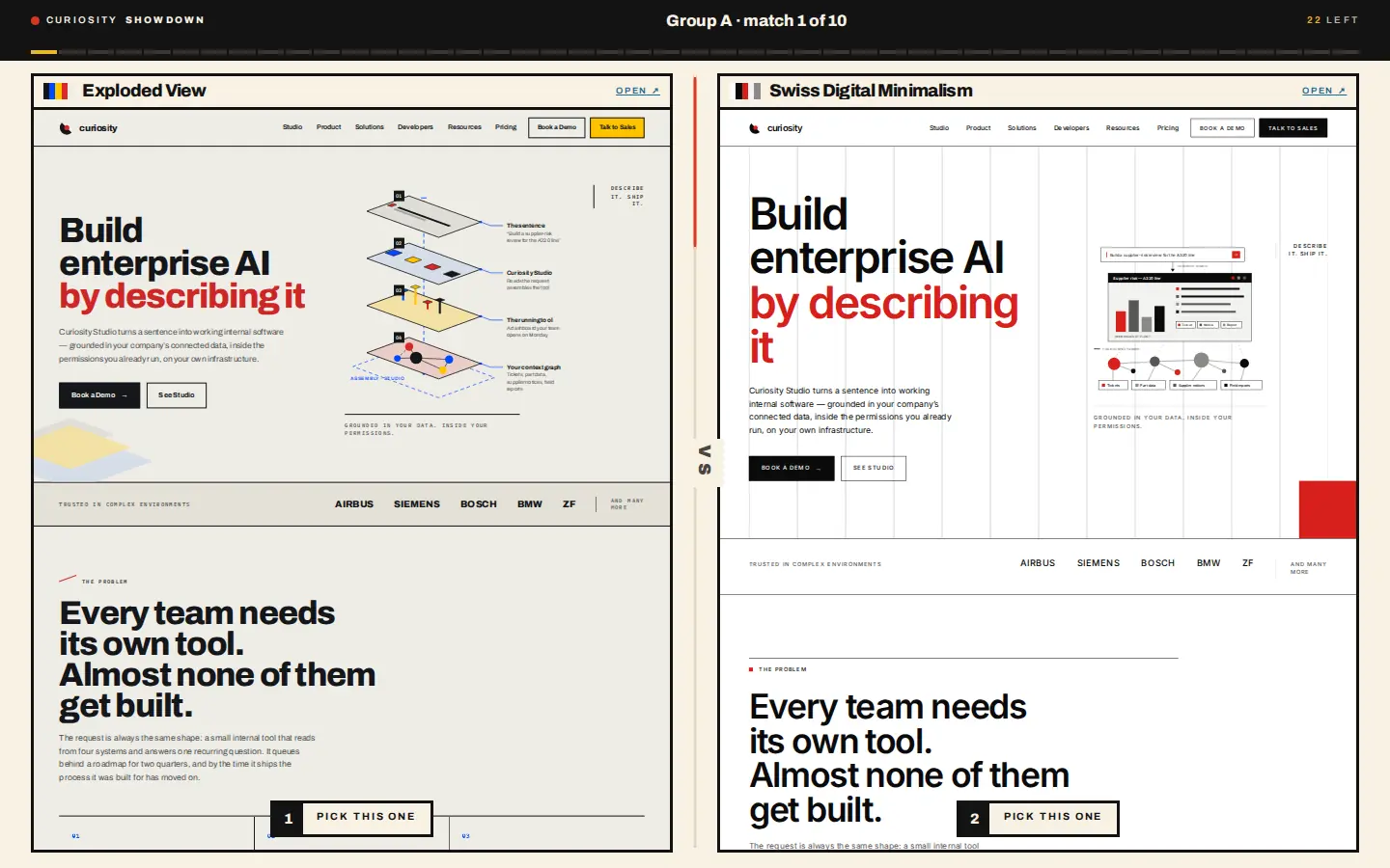
The showdown puts two directions next to each other as live previews, scrolled together to the same fraction of the page, and you pick the one you would rather read. A group stage comes first, so no direction goes out after one comparison, then a knockout: 47 matches, about twelve minutes. At the end it hands you a fourteen-character code that replays every match you played, so we could collect votes without collecting anything else.
Three details mattered. The previews differ by their direction and nothing else, so the first-load intro animation is suppressed in both. Scrolling is the same fraction of the document, not the same pixel, because the designs spend very different heights on the same argument. And on a phone the whole card is the pick button, so a drag of more than a few pixels does not count as a vote.
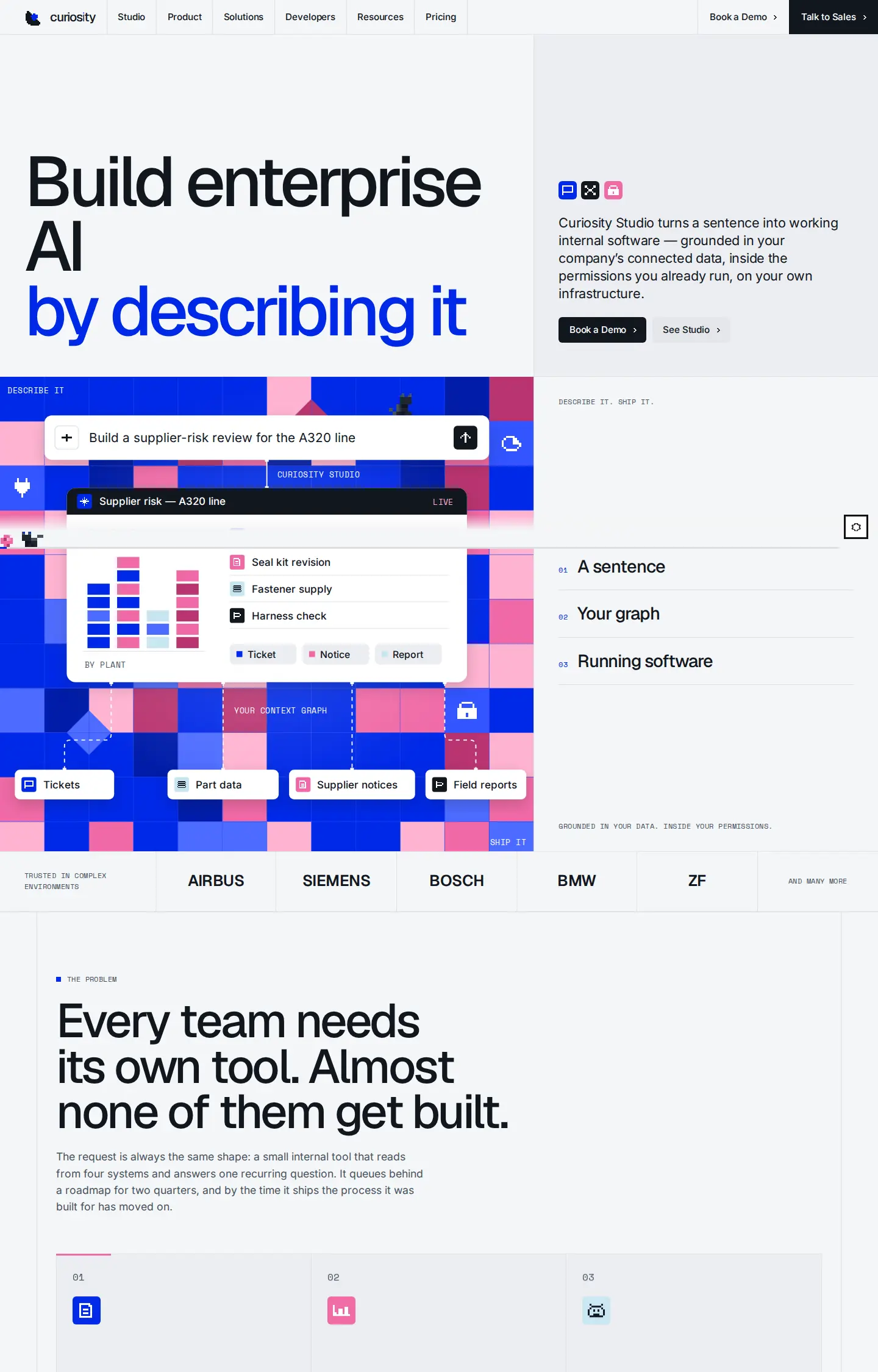
Yarn Mosaic won. It became the main site and the other twenty-one were deleted, with their tooling.
Three days: the brand arrives
In parallel, our design work was happening on a canvas of boards in Claude Design: the mark,
the wordmark and lockups, type and color, the pixel glyphs, the dash field, templates for the
blog, slides and LinkedIn, Sudo, and diagram posts. It came back as one file, BRAND.md, written
for a reader that has no eyes. Its first rule says so:
Success criterion for any asset: could another agent reproduce it from these rules without seeing it? If a choice cannot be written as a rule or a number, do not make it.
That file is what made three days possible. On September 28 the site was restyled to it. Yarn Mosaic kept its structure (the hairline cells, the section order, the page modules, the walking Sudo) and gave up its palette, its type and its tile mosaics. Monochrome, with one electric blue. Schibsted Grotesk and Geist Mono. A generated dash field as the only texture.
Then we did the same trick again, inside the brand. A style switch in the corner of every page offered four rounds of exploratory styles built on the brand's parts: Blueprint, Pixel and Tiles, then Mosaic, Contour and Blocks, then four that change the layout, not only the color.
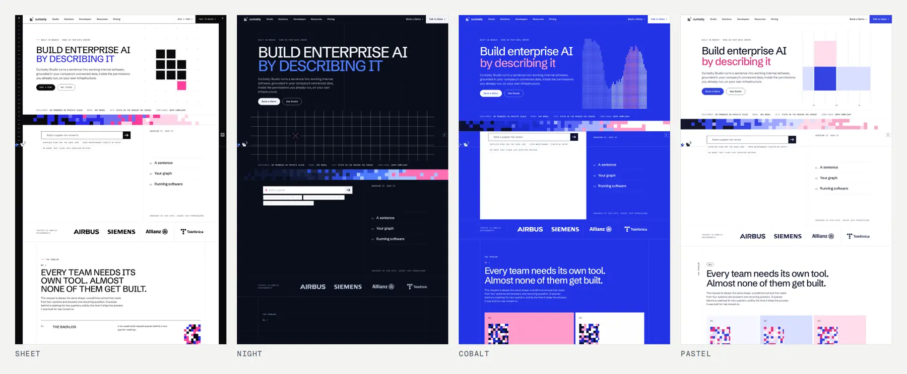
The winner the second time was a mix. Blend takes each section from whichever style did it best: the hero from the brand, the Studio steps as a staircase from Blocks, the solutions as full-width rows from Sheet, the industry tiles from Mosaic. Blend Rows, its variant with the hero set in rows over a dark field, became the site's default on September 29. The rest of those two days went into the pages under it (pricing, customer stories, the developer overview, the Trust Center, integrations and models), most of them by the same move: three previews side by side, one kept.
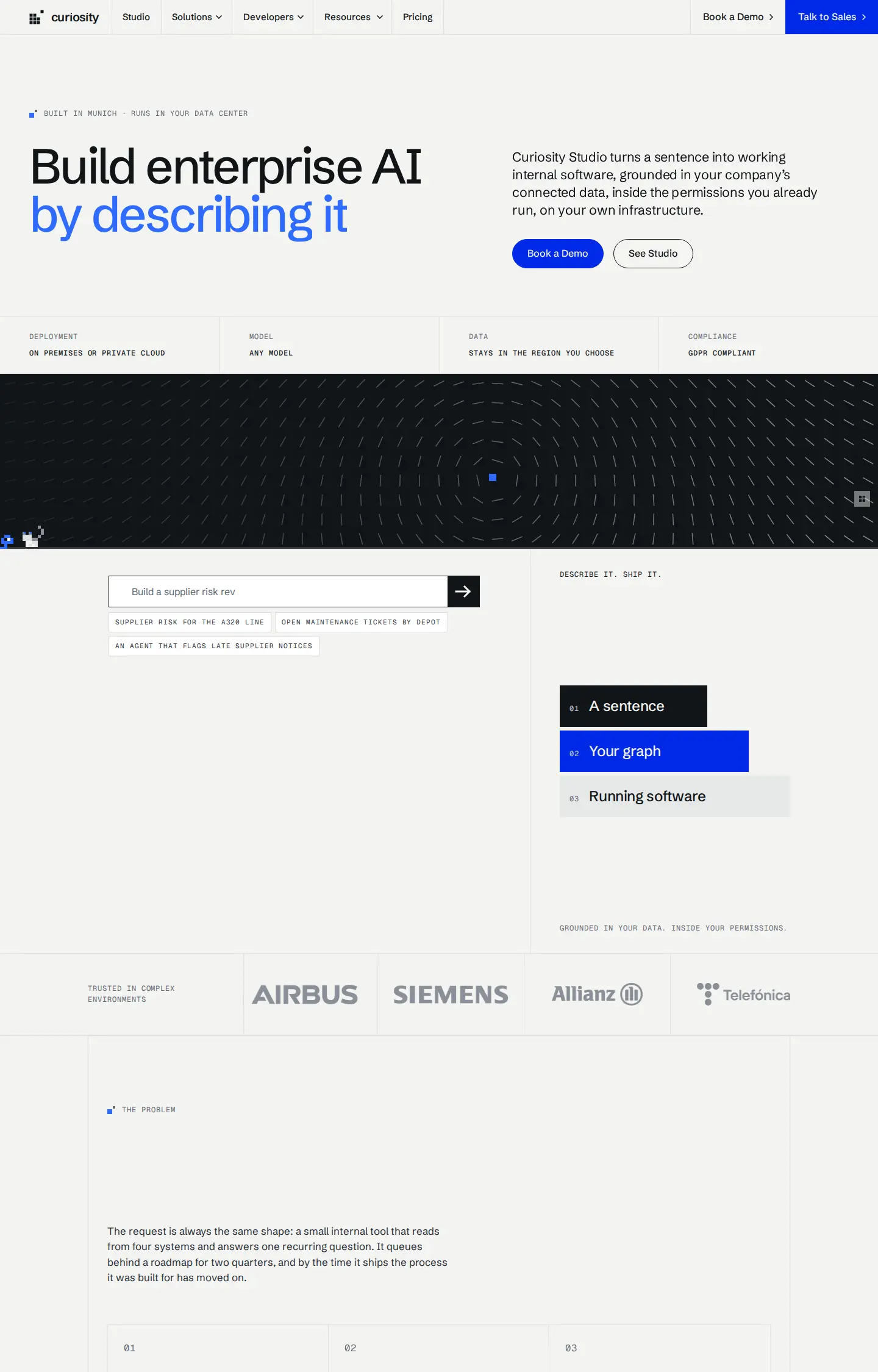
The website repository took about two hundred commits across those three days. The code was written by Claude Code, working from a brief it could read. Every change went through a pull request that one of us looked at on the rendered page and merged.
The illustrations, in the brand
The brand kept the rule that everything is drawn, and gave the drawings a grammar. Boxes are 1px hairlines with square corners. Graph nodes are squares, sized by importance, in four tones. Connectors are straight, solid for "flows to" and dashed for "derived from". Labels are mono uppercase. One Signal, the electric blue, marks the single step a diagram is about.
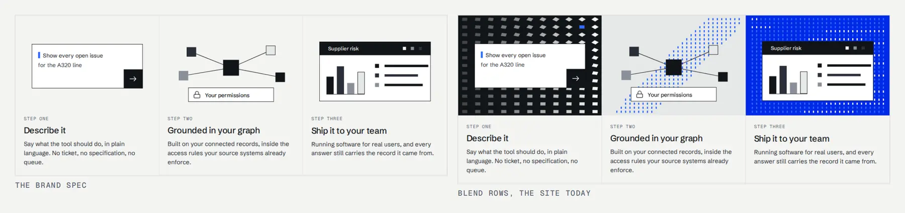
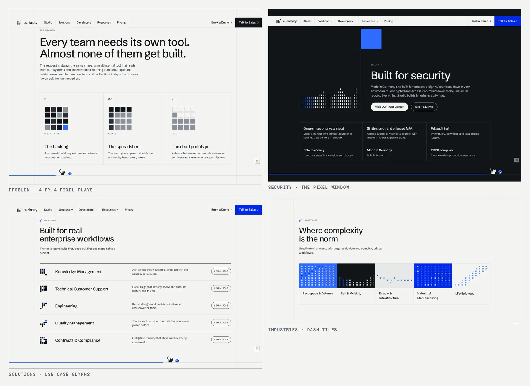
On that grammar sit a few kinds of drawing, each with a helper in site/figures.js. The value
glyphs are the brand's own 4 by 4 pixel glyphs, read off its board as coordinates. The use case
glyphs were drawn in the same grammar: a magnifier with the source in its lens, a wrench with the
bolt in its jaw. The problem section plays its three cases as pixel animations on a 4 by 4 grid.
The security band shows a pixel window: the mark scaled up, with a dash field inside it and the
escaped square in Signal. The dash field is generated, never drawn, and its signal pixel drifts
toward your pointer.
One design language for everything we publish
The blog, the documentation and the slides we present from should be the same thing as the website, and all of it should be something an agent can work on. Everything we publish outside the website is built with Neko, our own static site generator: Markdown in, HTML out.
The blog you are reading wears curiosity.ai's own chrome. The masthead, the closing call, the footer and Sudo are drawn by the website's own stylesheets and scripts, rescoped by a sync script and rendered inside shadow roots, so they are pixel for pixel what curiosity.ai draws. The card and header images on every post are drawn from the same 4 by 4 pixel glyphs, by a script that renders them to PNG. The documentation uses the same chrome, with its own links and drop-downs drawn as the website's cells.
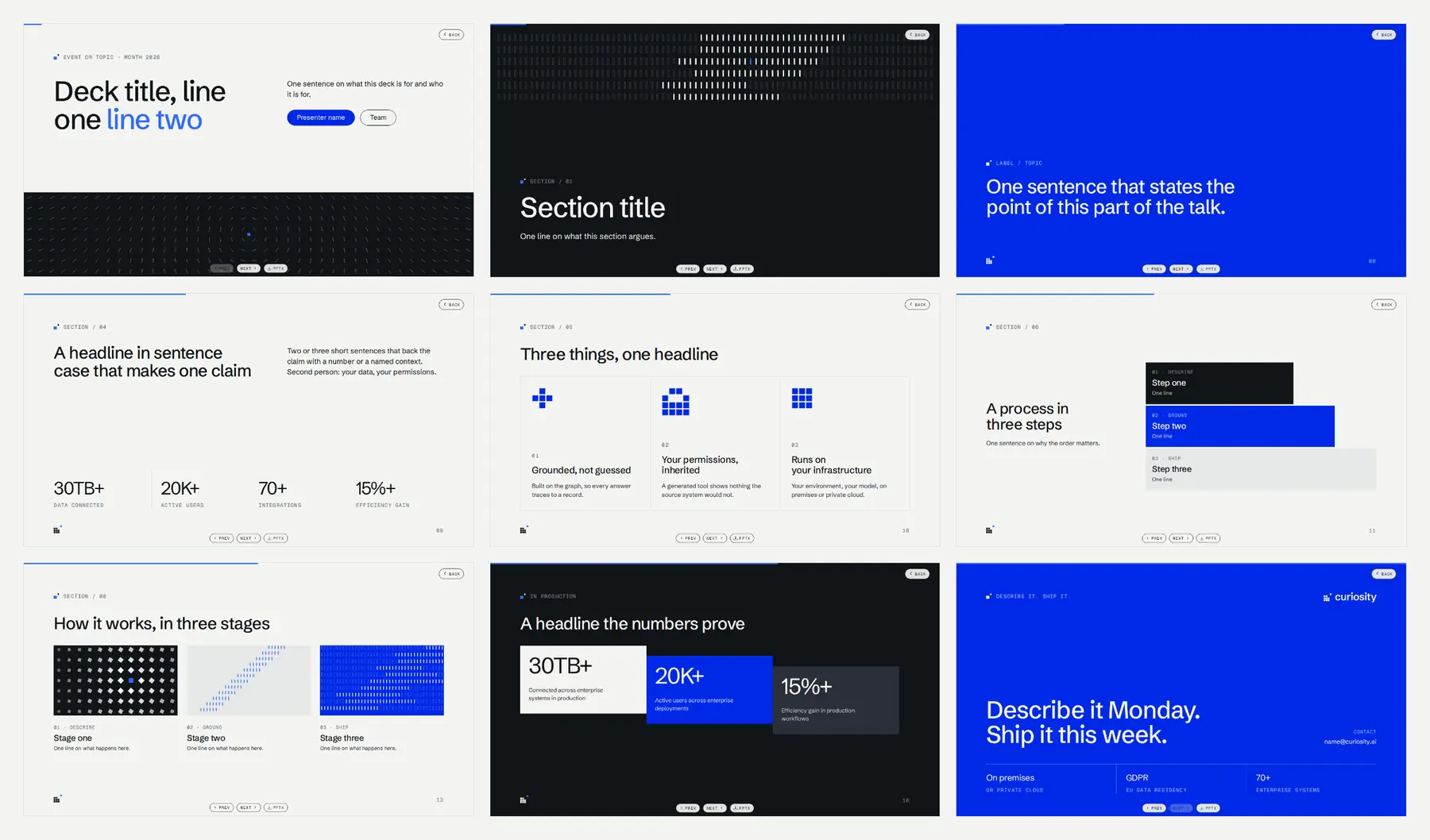
The slide decks are one Markdown file each. A presentation: block in the front matter, a
--- between slides, and a layout per slide: cover, section, statement, split, number,
closing, with blocks for agendas, steps, timelines, quotes and comparisons. The curiosity theme
draws them in the brand, fields and pixel glyphs included, and they export to PowerPoint with the
fonts embedded, for the people who need a .pptx.
Everything is text an agent can read and write, and every repository carries the instructions
for it. The site has a CLAUDE.md that is the brief, and BRAND.md is imported into it. The
blog carries one skill per Neko component, so an agent knows the exact syntax of a card, a tab or
a slide layout. When the brand changes, one file changes, and the next session reads the new one.
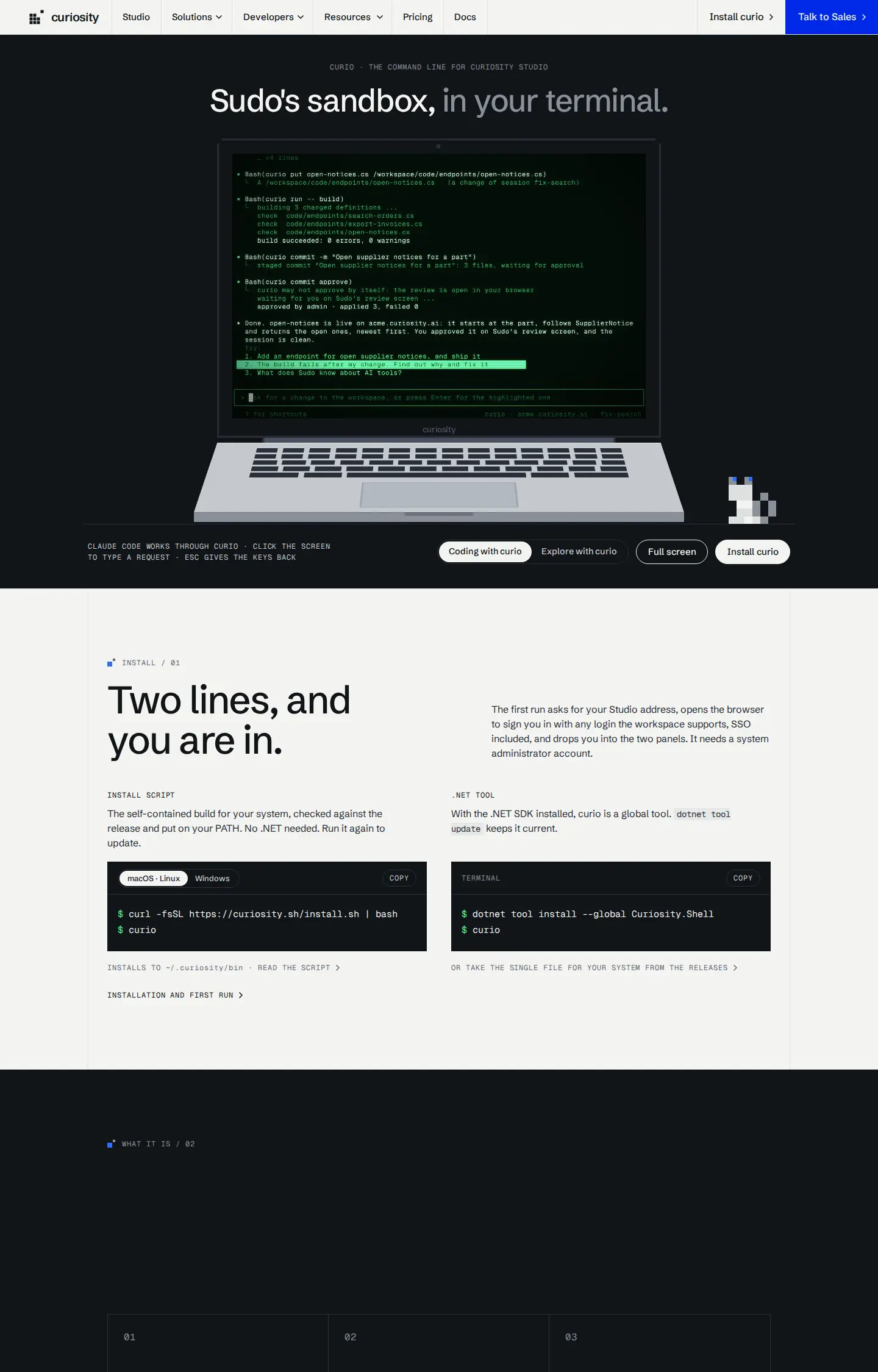
It also worked the other way. When we built curiosity.sh, the site for curio, our new command line, we started from the website's shell: its generator, navigation, stylesheets and scripts. We wrote one page, and it was on brand from the first commit.
The brand: think outside of the box
The brand fits in one line: one pixel leaves the box. Industrial data is a dense, ordered grid. Curiosity is the one element that steps outside it and asks the question nobody asked. Every visual in the system comes from that: a grid of identical units, and one exception.
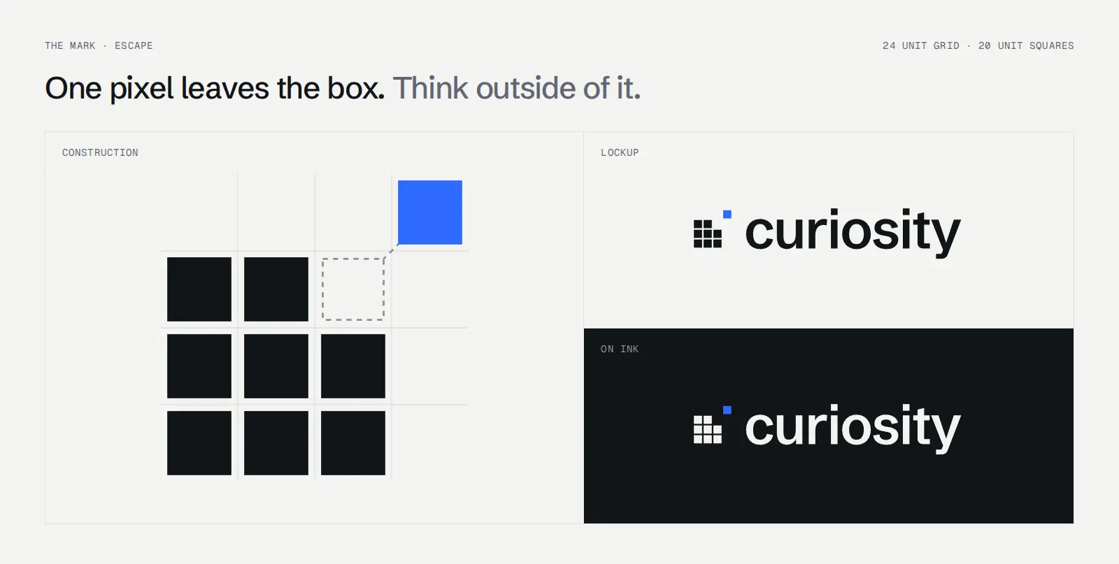
The mark is Escape: a 3 by 3 block of squares with its top right square stepped one cell out
on the diagonal. There is one mark, with no secondary symbol and no letterform version. The
wordmark is curiosity in Schibsted Grotesk, with both i's set dotless and a square where each
dot would be. Where the mark is absent, the second square carries the Signal.
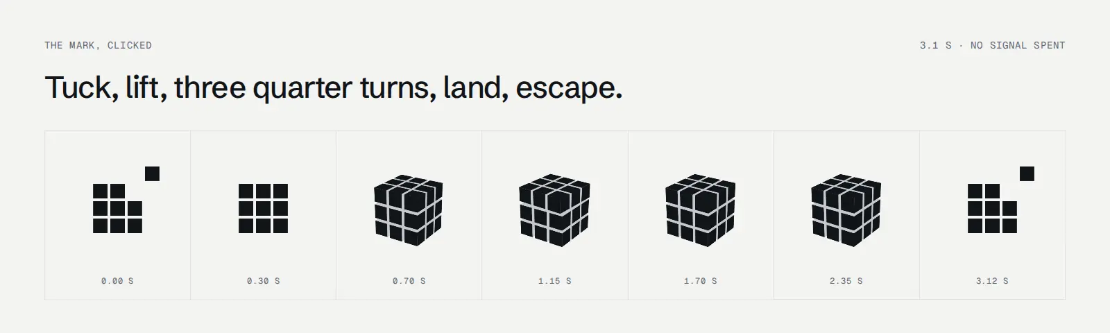
The mark is allowed one trick. Click it in the masthead and it becomes a cube: the escaped square steps home, the block grows depth, three layers make a quarter turn each, and the cube faces you again, flattens, and lets the square back out. It takes 3.1 seconds and spends no Signal.
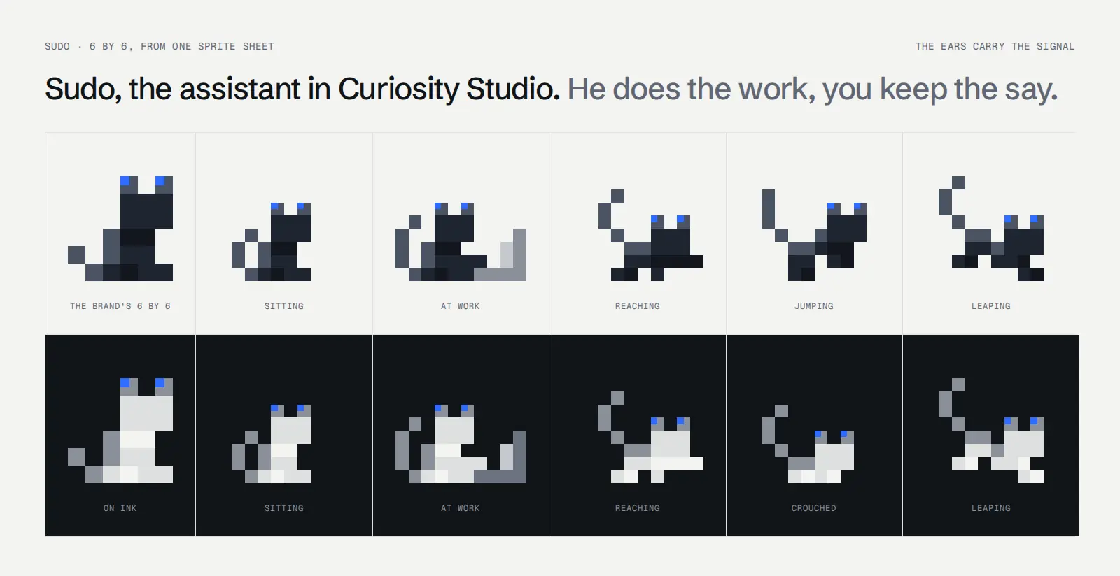
Sudo is the assistant in Curiosity Studio, and in the brand he is a pixel cat on a 6 by 6
grid: a detail, never the subject, his state shown only by the two Signal half cells in his ears.
On the website he walks, a deliberate exception written down as one. He chases his ball along the
foot of the page, sits at a laptop under the flow heading, falls asleep after a minute, and when
the page runs out he jumps into the footer and asks if you want to build something together. Type
sudo on a page of curiosity.ai and see what he does.
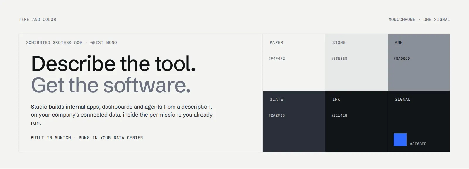
The rest of the system is monochrome, from paper through stone, ash and slate to ink, with one electric blue that appears at most once per layout. Structure is a 1px hairline, radius is zero except on pills, and there are no shadows and no gradients. Two families: Schibsted Grotesk for everything read, Geist Mono for everything that is part of the composition.
What we learned
While writing this post we came across How our vibe coded website looks like a designer made it, where Yakko Majuri at Railcode documents every prototype of their site next to the prompt that made it. A different team and product reached the same conclusion: good design from coding agents comes from many iterations, constant human judgment and prototypes you can see. What we would add:
1. Judge real pages, not mockups. Every direction was the whole site with the real words. A style that wins the first screen and falls apart on the fourth should lose, and you only find that out on a real page.
2. Make a variation cost minutes, then make lots of them. A palette on an arrow key. A direction as a copy of the site. Three layouts of a page side by side, keep one. When trying an idea costs almost nothing, you try the strange ones, and the strange ones taught us the most.
3. Decide pairwise, and make the vote replayable. Two at a time, first instinct, a code that rebuilds every match. Everyone got the same question in the same form.
4. Write the brief as if it were the product. Our CLAUDE.md says "most of what looks like a
free choice has already been decided here". It holds the facts we may state, the section order
and why, the Signal budget per section, and the rulings where we overrode the spec, each with its
reason. It also records what was tried and taken out (scroll snapping, a pixel typeface, a
flamingo pink), so that nobody tries them again.
5. Specs should be numbers. "Modern and clean" produces something average. "The escaped square is 20 units on a 24 unit grid, one cell out on the diagonal" produces the mark. A rule an agent could not apply without seeing the result is taste, and taste belongs to the person reviewing the page.
6. Keep the content fixed while the look moves. Twenty-two directions, and none was allowed to change a fact. The brief lists the numbers we publish and says that a section that needs a proof point not in the table stays empty and gets flagged. A model under pressure to fill a slot will fill it with something plausible. The DPA page showed its structure and no text until the approved wording arrived, because plausible terms that look finished are worse than an empty page.
7. Build the checks, then check the checks. The responsive checker reported a clean pass on every page for its whole early life without inspecting one. It now prints how many page widths it looked at: a checker that cannot tell "looked and found nothing" from "did not look" is worse than none. One change around a figure can push labels under the floor on dozens of pages at once, so the build fails when a label drops under 9px.
8. Look at it. Every change ended with the page rendered in a browser and looked at, by the agent and then by us. The agent took the screenshots in this post. Overflow checks pass on pages that are ugly.
9. Delete the losers. Twenty-one directions were expensive to keep in step. When one won, the rest went, with their tooling. What we wanted from them was written into the brief as lessons, not kept as code.
10. One source for every shared part. Sudo's sprite sheet exists once and is loaded by the browser and by the build. The blog's chrome is the website's own stylesheets, synced. The brand spec is one file, imported into every repository. When a part has two copies, an agent will update one of them.
The Bauhaus version is no longer the site, and neither are the other twenty; they live on in an experiments repository. We would not have ended up with this brand without them, or without a school that closed nearly a hundred years ago and still makes people ask how things should look.
Read next
Articles on context graphs, enterprise search and industrial AI